Human-Machine Interface · Automated Retail

Designing a bartender's judgement into a machine.

Product Design UX / UI Design System 2026
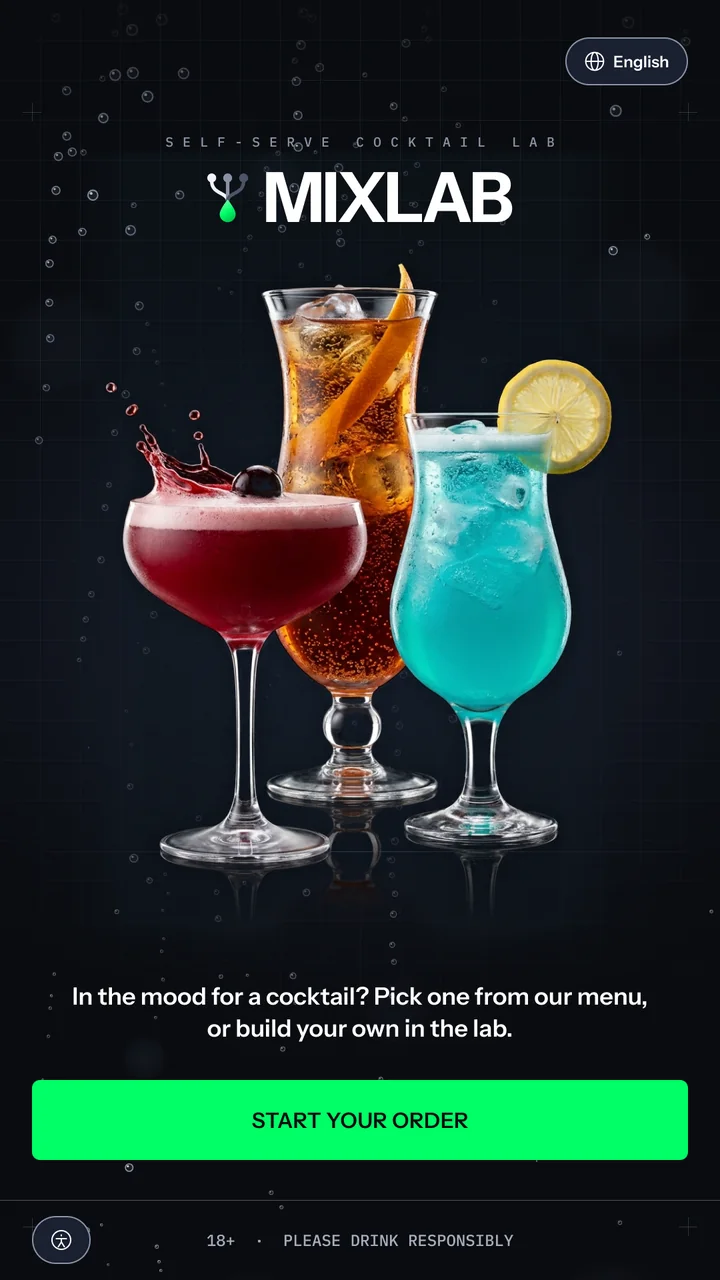
MixLab start screen: the wordmark over a lab grid with rising bubbles, three cocktails in a coupe, a hurricane and a tall glass, the line In the mood for a cocktail? Pick one from our menu, or build your own in the lab, and a full-width Start your order button.
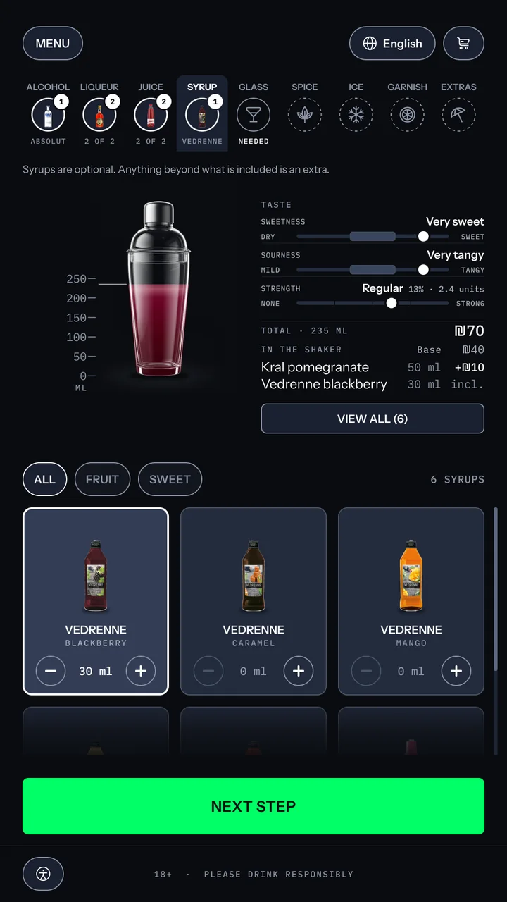
Build screen, syrup: the shaker filled to 235 ml in deep red, a read-out of six ingredients with two paid extras and a ₪70 total, meters reading very sweet, very tangy and regular strength at 13%, and a grid of syrups with blackberry selected.
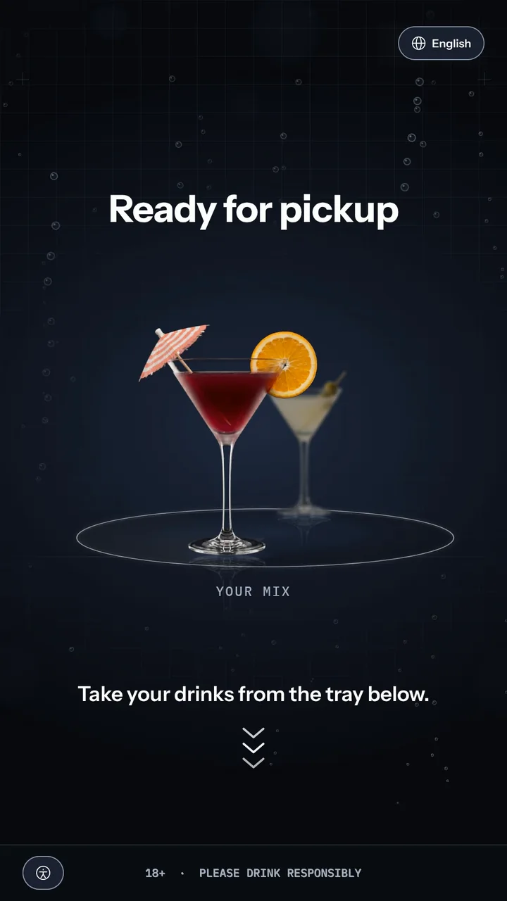
Ready for pickup: two drinks on a turntable at life size, Your Mix in front, over a lab grid with bubbles, and the instruction Take your drinks from the tray below with chevrons pointing down.

MixLab is a self-serve cocktail machine that measures, shakes and pours on its own. Guests order a ready-made cocktail or build their own from nine categories. The screen does the rest of a bartender's work: it checks age, explains what goes into the drink, takes payment and hands it over. I was the sole designer and designed MixLab end to end, including every state a public machine has to survive.

From the research

80%
Give up on a drink when the bar queue is long
40%
Have had a drink come out too strong or too sweet
82%
Feel more at ease ordering from a machine
92%
Want to see the drink before they order

Survey of people who order cocktails.

The Challenge

A bar without a bartender.

Guest view

Ordering a cocktail means trusting someone else's judgement. 40% have been served a drink too strong or too sweet, and 80% give up on a drink when the bar queue is long.

Venue view

With no staff on hand, the machine carries the responsibility a bartender would: checking age before anything is built, never taking a payment twice, and never leaving a half-finished order for the next guest.


Competitive Analysis

Every screen sells the drink. None shows it being built.

I benchmarked the kiosks guests already order from, in Israel and abroad: cocktail kiosks that serve alcohol, and the restaurant self-order kiosks guests use every day. Each gets part of the job right. None lets a guest build a drink on the screen, preview it, and see taste and price update before paying.

Capability Cocktail Kiosks Yanu, Cecilia.ai, TendedBar Self-Order Kiosks McDonald's, Wok to Walk MixLab Where the design competed
Ordering Surface Touchscreen, voice or face scan Portrait touchscreen ✓One portrait screen, start to finish
Customisation Pick from a menu, light tweaks Add or remove per item ✓Nine categories, any order
Pre-Order Preview Drink name only Stock photo per dish ✓Live shaker, filled to scale
Taste & Strength Set by the recipe Out of scope ✓Sweetness, sourness, ABV, live
Price Transparency Price per drink Updates per item ✓Running total, every extra itemised
Age Verification Face scan or ID, on some units Out of scope ✓ID on a lit panel, no copy kept
Wait Experience Watching the robot Order number on a board ✓A game synced to the pour

Accessibility beyond a reach mode

McDonald's reach mode lowers the top of the screen. In MixLab every control sits within wheelchair reach by default, and the lowered mode moves everything down, exit included. All text passes WCAG AA, with an 18 px floor.

One ID check, modelled on airport e-gates

TendedBar offers four compliance levels. MixLab commits to one: an ID on a lit panel, read in about two seconds, date of birth only, no copy kept, valid for the whole visit. Guests who aren't drinking skip it in one tap.


Design approach

Taste the drink with your eyes first.

With no bartender to describe the drink, the screen has to show it. Every screen was held to three questions: can a first-time guest finish without asking anyone, can they see what the machine is doing, and does the screen say what to do next? That is why the cocktail is broken into nine categories, taken in any order, with a tab bar that tracks what is chosen and what is left. With every pour the shaker fills against a real millilitre scale, in the drink's true mixed colour, computed by volume and each ingredient's pigment strength, while sweetness, sourness and alcohol strength move with it.

From a finding to a feature

92% want to see the drink first
The live formula

The shaker fills to scale in the drink's real colour with every pour.

100% want the price first
The price, before the tap

₪40 covers one of each category. Every extra shows before it's added.

40% had drinks too strong or sweet
Taste you can read

Sweetness, sourness and strength move live with every pour.


The Persona

One guest, both ways in.

Most visits aren't one drink. They're a round.

Mor Shalev
32 · Tel Aviv · Product manager

Out on a Friday with her friend Itai, at a MixLab machine for the first time. She knows what she likes and doesn't want to explain it to a bartender over the music. She orders a ready-made drink for Itai, builds her own, and wants to see the price before every tap.

Drives the decision
Speed · Control · Price

A proto-persona, built from the survey and the benchmark. Her visit is the journey below.


Mor's journey

One visit, two drinks, every screen.

Mor orders for two in one visit: a ready-made Clear Formula for Itai, then her own drink, built from nothing. Following her through every screen shows how the two paths share one menu, one cart and one payment, and where the machine takes over.

The full user flow

Start / end Guest action Decision Machine step
Start your order ID check Main menu Picks Clear Formula Picks a size Adds to cart Mix your own Alcohol Liqueur Juice Syrup Glass Skips spice Skips ice Orange slice Paper parasol Confirm your drink Adds to cart Opens the cart Continue to payment Tap to pay Approved Receipt? Print Print Plays Ice Drop while the drinks are made Collects the drinks Thank you

Enter

1 · Start screen

1
Accessibility button
Accessibility, one tap away
The accessibility button sits bottom left on every screen. One tap lowers the whole interface within wheelchair reach.
MixLab start screen: the wordmark over a lab grid with rising bubbles, three cocktails in a coupe, a hurricane and a tall glass, the line In the mood for a cocktail? Pick one from our menu, or build your own in the lab, and a full-width Start your order button.
1

2 · ID check

1
Illustration
Shown, not described
The ID over a lit panel, the arrow pointing at the real reader.
1

A ready-made drink for Itai

3 · Menu

1
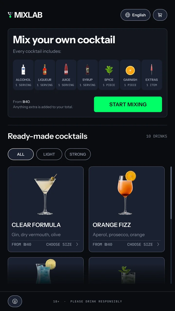
Mix your own card
What ₪40 includes, shown
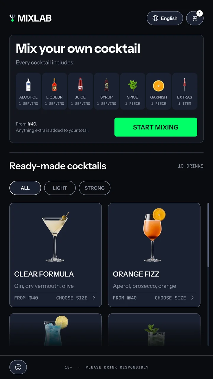
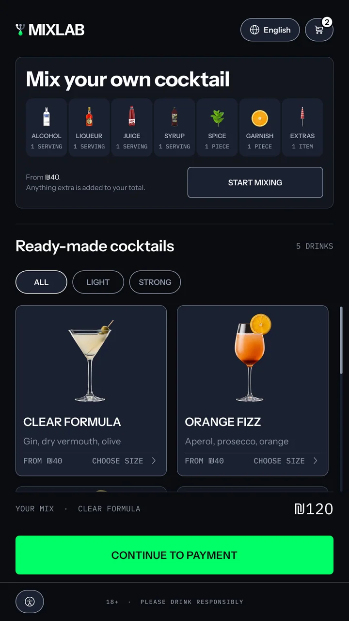
Seven categories, each labelled with its portion: one serving, one piece or one item.
Main menu: a Mix your own cocktail card listing what every cocktail includes, one serving of alcohol, liqueur, juice and syrup and one spice, garnish and extra, from ₪40, with a green Start mixing button, then five ready-made cocktails with All, Light and Strong filters, starting with Clear Formula and Orange Fizz, each with its ingredients, a From ₪40 price and Choose size.
1 2
2
Filter chips
Light or strong
The two filters answer the question guests actually ask.

4 · Clear Formula, picked

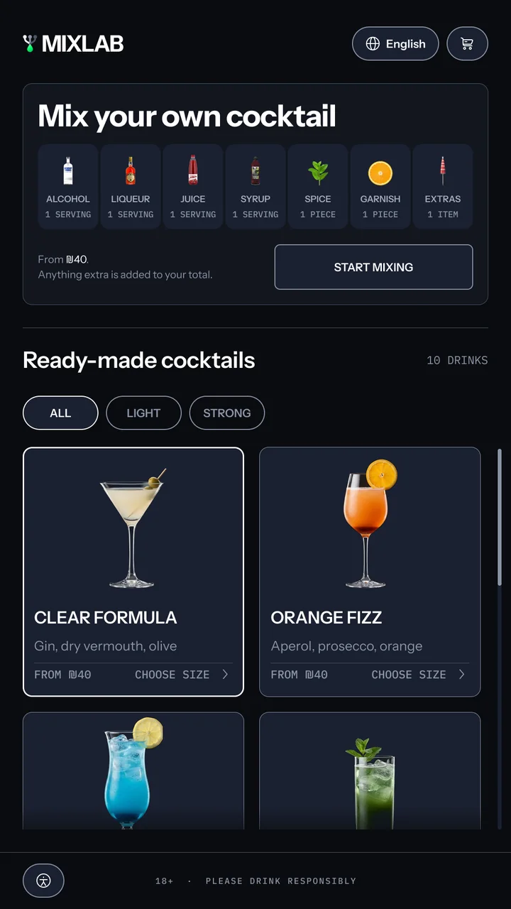
The moment Mor taps Clear Formula: its card pressed, with a white outline and a lighter fill. Every card reads From ₪40 and Choose size, and there is no add button on the menu, because the size is chosen on the next screen.

5 · Choose a size

1
Size picker
Size first, then the cart
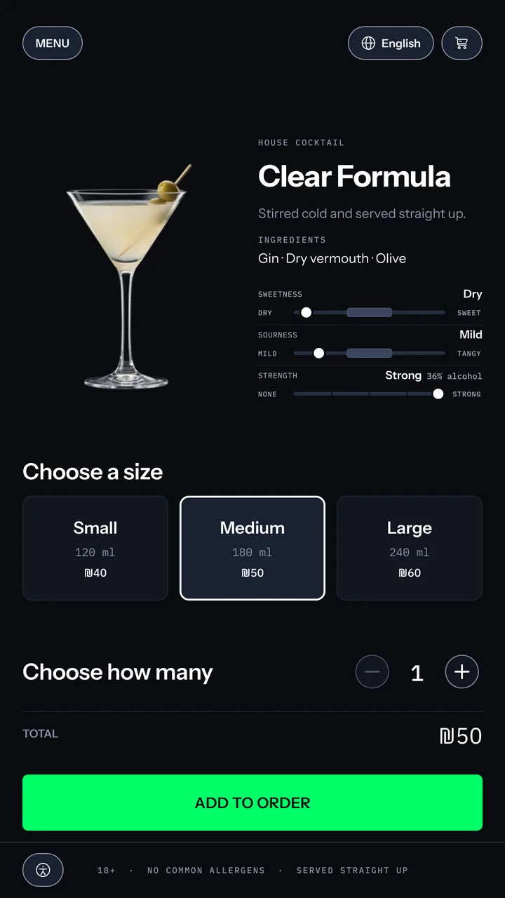
Three sizes, each with its volume and price, chosen before the drink goes in the cart.
Drink detail for Clear Formula: the martini beside its name, the line stirred cold and served straight up, its ingredients, taste meters reading dry, mild and strong at 36%, three sizes with Medium 180 ml at ₪50 outlined in white, a quantity stepper at 1, a ₪50 total and a green Add to order button.
1 2
2
Taste meters
Taste, read before ordering
Sweetness, sourness and strength for every drink: dry, mild, strong at 36%.

6 · One in the order

The menu again after adding Clear Formula, with a 1 on the cart icon and Start mixing back as the green action.
1
1
Cart icon
The cart confirms it
A badge on the cart counts the drink she just added.

Her own drink

7 · Alcohol

1
Tab bar
Nine categories, any order
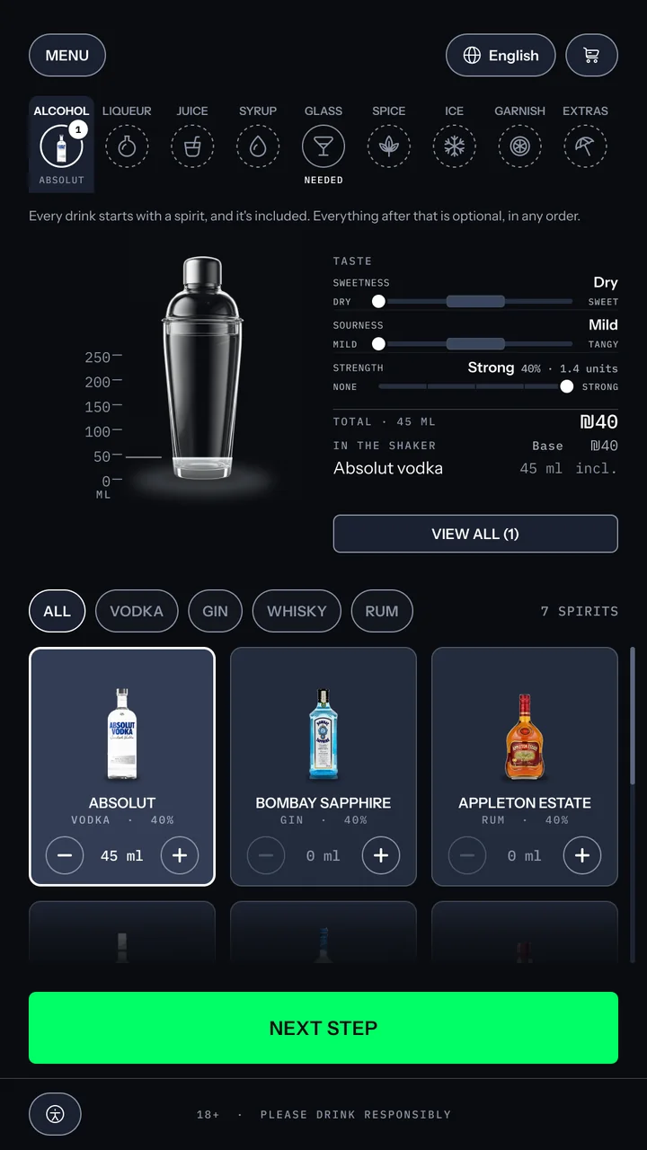
Each tab shows what is chosen and what is left. Only the glass is required.
2
Filter chips
Spirits by type
Vodka, gin, whisky or rum: one tap narrows the grid to the spirit she knows.
Build screen, alcohol: the line every drink starts with a spirit and it is included, a transparent shaker with 45 ml of vodka against a millilitre scale, a read-out with the ₪40 base, and a grid of seven spirits with Absolut selected at 45 ml.
1 2 3
3
Taste meters
Taste from the first pour
Sweetness, sourness and strength update with every ingredient she adds.

8 · Liqueur

1
Step note
The price, before the tap
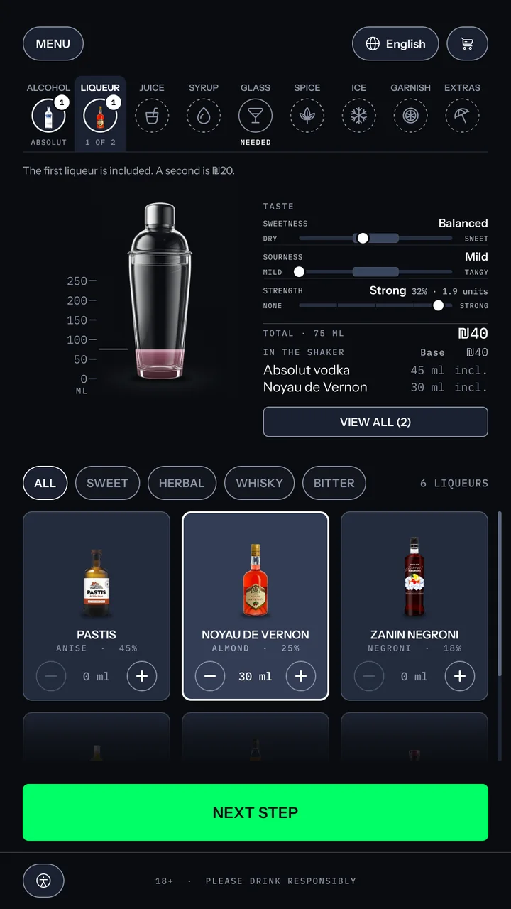
The first liqueur is included. A second is at an extra charge.
Build screen, liqueur: the note that the first liqueur is included and a second is ₪20, the shaker at 75 ml, and Noyau de Vernon selected at 30 ml.
1

9 · Juice

1
Shaker
The drink's true colour
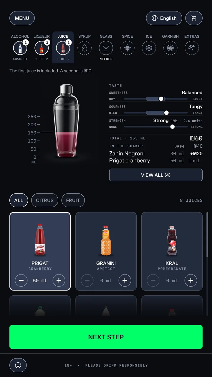
Mixed by volume and pigment strength: vodka barely moves it, cranberry turns it deep red. A shaker isn't layered, so neither is the drawing.
Build screen, juice: the note that the first juice is included and a second is ₪10, the shaker at 155 ml turning red, a second liqueur added at +₪20, and Prigat cranberry selected at 50 ml, total ₪60.
1

10 · Syrup

1
View all button
Every choice, one tap away
View all opens the full list of what she has chosen so far.
Build screen, syrup: the shaker filled to 235 ml in deep red, a read-out of six ingredients with two paid extras and a ₪70 total, meters reading very sweet, very tangy and regular strength at 13%, and a grid of syrups with blackberry selected.
1 2
2
Taste meters
Taste moves with every pour
Very sweet, very tangy, 13%.

11 · The glass

1
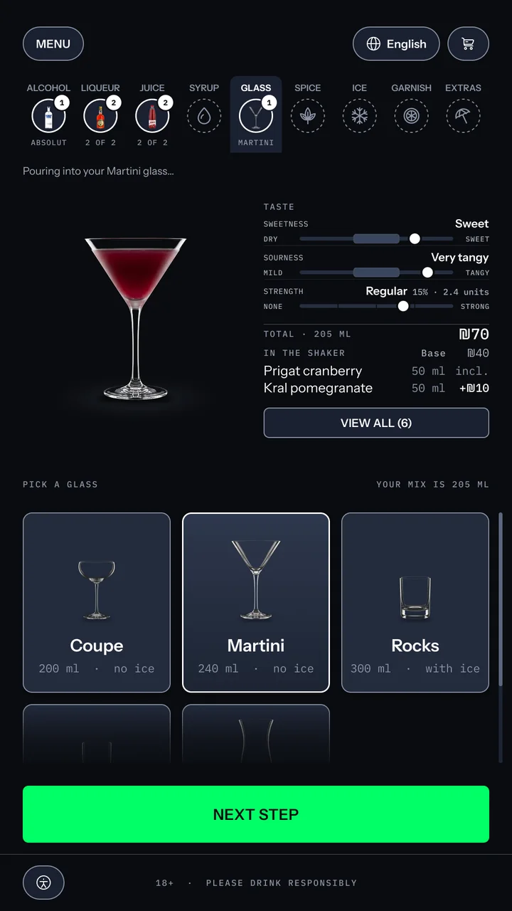
Glass preview
The drink in its glass
From here on, the glass is the vessel: ice, garnish and extras land on it.
Glass step after the pour: the line Pouring into your Martini glass, the drink now in a martini glass, taste meters reading sweet, very tangy and regular at 15%, the ingredients read-out with a View all button, and the glass cards with Martini chosen, each showing its capacity and whether it takes ice, above a green Next step button.
1 2
2
Glass cards
Her glass, her choice
Guests want to choose the glass their cocktail is served in, so each one shows its size and whether it takes ice.

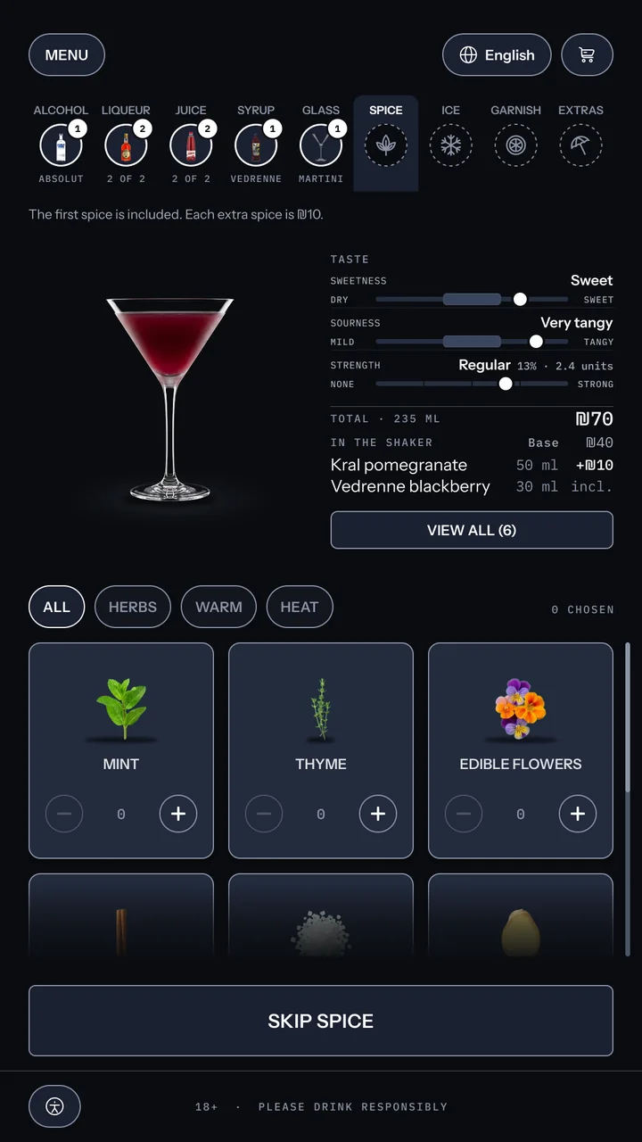
12 · Spice

Build screen, spice: the note that the first spice is included and each extra is ₪10, the drink now in its martini glass at 235 ml, and a grid of herbs, warm spices and heat with none chosen.
1
1
Skip button
Skipping is never green
Green means the next step only, so a skip is an outline.

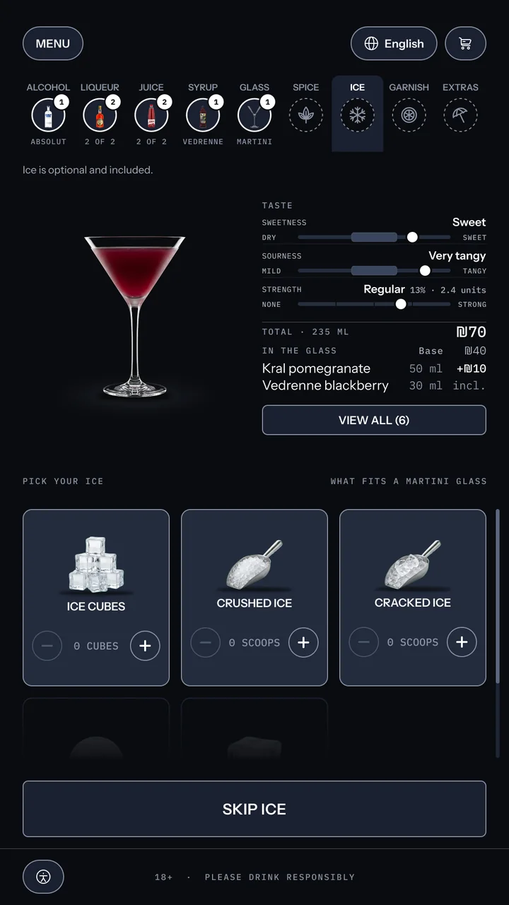
13 · Ice

Build screen, ice: ice options filtered to what fits a martini glass, with the ice sphere and large cube marked too big for this glass. Mor chooses none, because a martini is served straight up, and the action reads Skip ice.
1
1
Ice options
Filtered to the glass
Ice that doesn't fit a martini glass is marked too big.

14 · Garnish

1
Ingredient card
The exact piece, shown to size
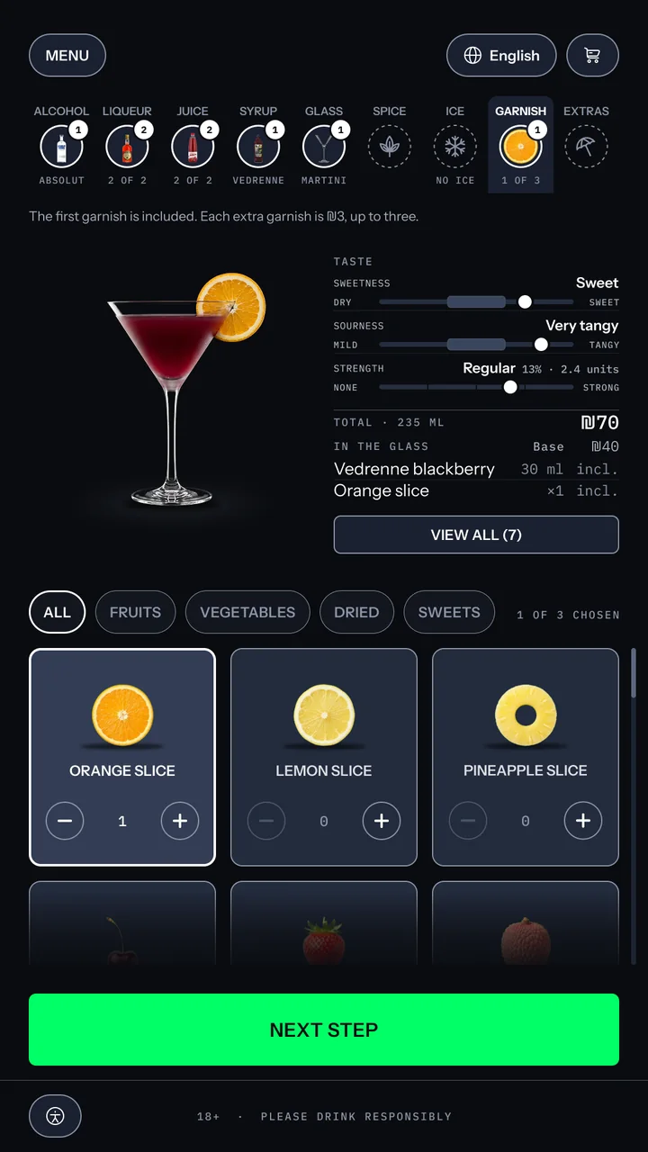
Each card shows the piece she will get at its real proportions, so the choice is visual, not a guess.
Garnish step: the drink with an orange slice on the rim, the note that the first garnish is included and each extra is ₪3, up to three, and a grid of fruit with the orange slice chosen.
1 2
2
Step note
The price, said once
The first garnish is included. Each extra is at an extra charge, up to three.

15 · Extras

1
Glass preview
Every choice lands on the glass
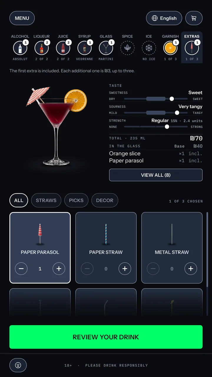
The orange slice and the paper parasol appear on the rim, exactly where they will sit when served.
Extras step: a paper parasol added beside the orange slice, the note that the first extra is included and each additional one is ₪3, up to three, and a grid of straws, picks and decor.
1

16 · Formula card

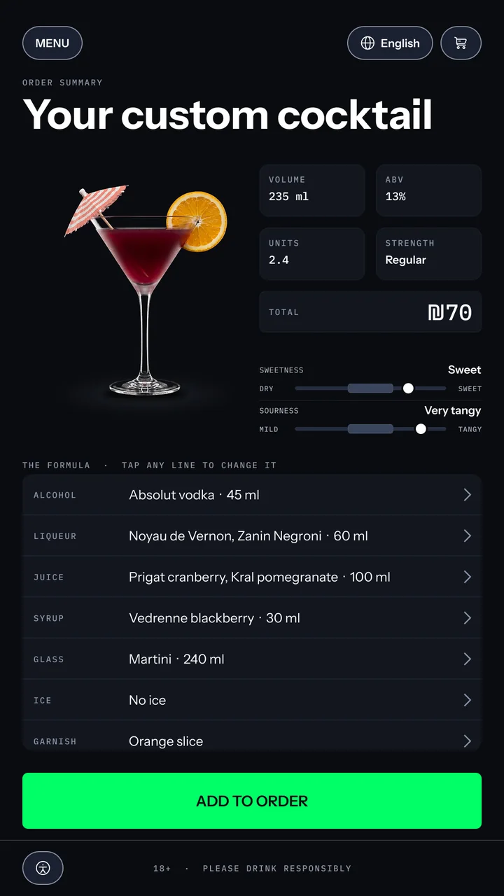
Formula card: the title Your custom cocktail beside the finished martini with a paper parasol and orange slice, tiles for 235 ml, 13%, 2.4 units, regular strength and a ₪70 total, taste meters, and eight formula rows from alcohol to extras, including the blackberry syrup and no ice, each tappable to change.
1
1
Formula rows
Every line is a way back
Tap any line to change it.

Checkout

17 · Two in the order

The menu with two drinks in the order: a 2 on the cart icon and an order bar reading Your Mix and Clear Formula, ₪120, above a green Continue to payment button.
1
1
Cart icon
Both drinks, in the cart
The badge now reads 2, and the order bar lists Your Mix and Clear Formula.

18 · Your order

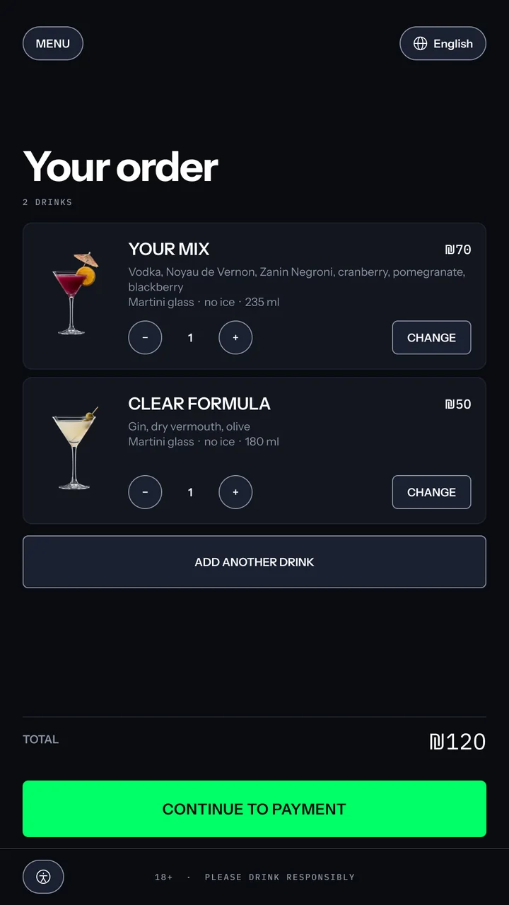
Order screen: two drinks, Your Mix at ₪70 and Clear Formula at ₪50, each with its recipe, glass and volume, a quantity stepper and a Change button, an Add another drink button, a ₪120 total and Continue to payment.
1 2
1
Change button
Every drink can be changed
Each drink has its own Change button, so she can edit it without starting over.
2
Add another drink
One more for the round
Add another drink sits right under the order, one tap away.

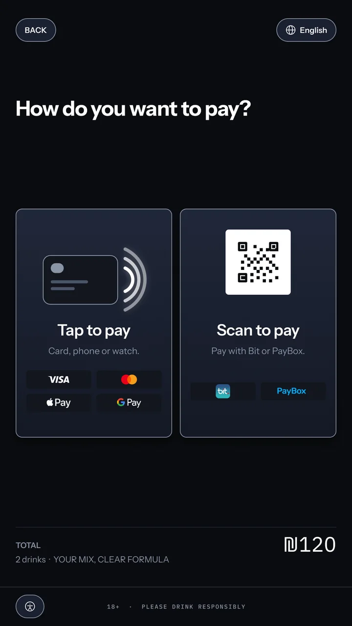
19 · How to pay

1
Two options
Two ways, both local
Tap a card, phone or watch, or scan with Bit or PayBox.
Payment choice: the question How do you want to pay?, two large options, Tap to pay with a card, phone or watch, and Scan to pay with Bit or PayBox, and the ₪120 total for two drinks.
1

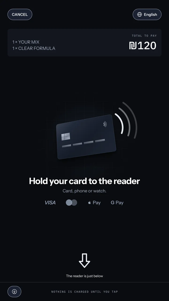
20 · Tap to pay

Tap to pay: the order lines and ₪120 total at the top, a card with contactless waves, an arrow pointing down, the title Hold your card to the reader, the line card, phone or watch, the reader is just below, accepted methods and Cancel payment.
1
1
Arrow
It points at the real reader
The reader is just below, and the screen says so.

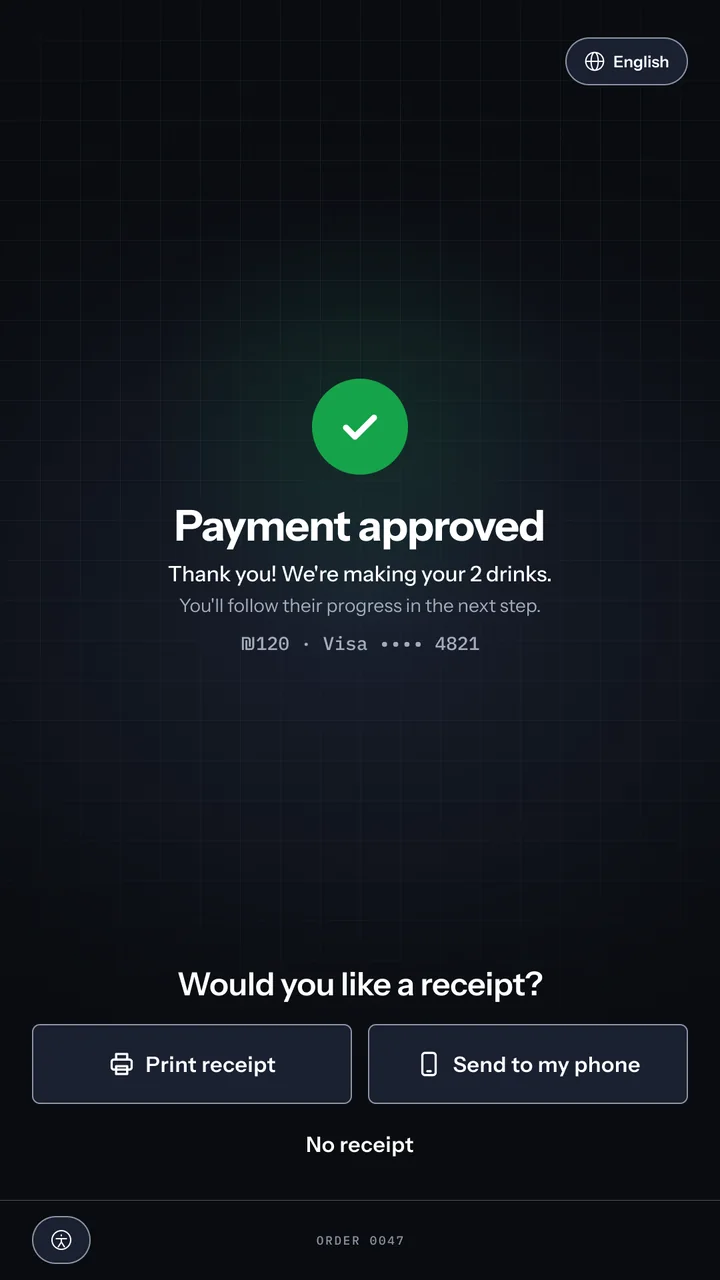
21 · Approved

1
Success mark
A calm green, not a button
Its own success colour, so the only neon stays the next step.
Payment approved: a green circle with a white check over the lab grid, the title Payment approved, the line thank you, we are making your 2 drinks, you will follow their progress in the next step, ₪120 paid by Visa ending 4821, and near the bottom the question Would you like a receipt? with Print receipt, Send to my phone and a No receipt text button.
1 2 3
2
Next-step line
What happens next, said at once
She will follow the drinks being made in the next step, so she knows her payment is already turning into her order.
3
Receipt
A choice, not a step
Print it, send it to her phone, or skip it.

22 · Printing

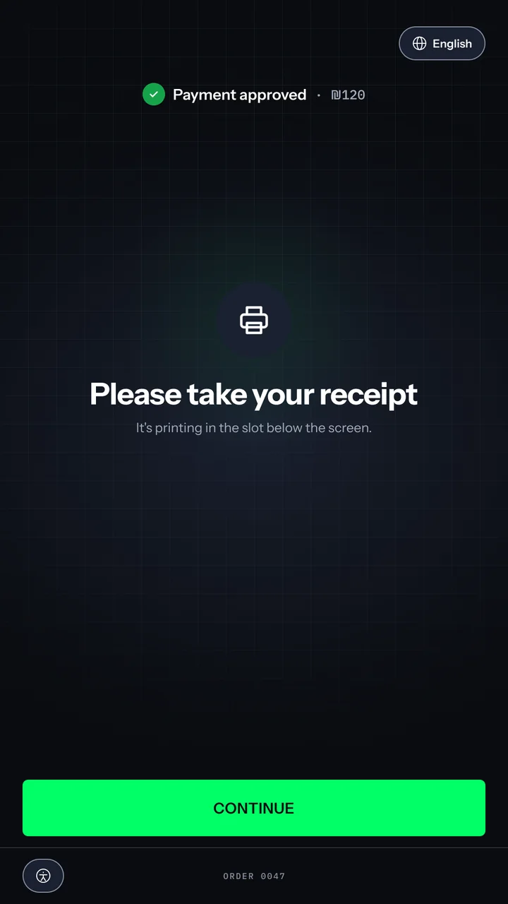
Printing the receipt: a compact payment approved line at the top, a printer icon, the title Please take your receipt, the line it is printing in the slot below the screen, and a green Continue to next step button.
1
1
Continue
Continue leads to her drinks
One tap takes her straight to watching both drinks being made.

The wait and pickup

23 · Ice Drop

1
Ice Drop
A game made for the wait
A short, playful game timed to the machine's real steps, so the rounds match how long the drinks take.
1 2
2
Timer
The wait is always visible
The timer never leaves the screen while she plays.

24 · Ready for pickup

1
Turntable
Both drinks, life size
Each drink turns to the front with its name.
1 2
2
Instruction
Where to look next
Take your drinks from the tray below.

25 · Thank you

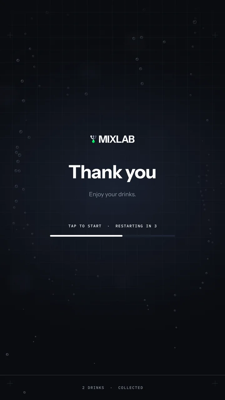
Thank you screen: the wordmark, Thank you, enjoy your drinks, and a countdown bar reading tap to start, restarting in 3.
1
1
Countdown
It resets itself
Restarting in 3, or tap to start.

Design system

Built to be read from a step away.

The dark canvas is a functional choice before an aesthetic one: in a low-lit bar it keeps glare down and lets the screen sit in the room instead of lighting it. Colour is rationed. A single neon green carries the lab identity and is reserved for the next step, which leaves the drink as the only other colour on screen. I built the system in Claude Code, from tokens to coded components, keeping design and build on one source of truth.

Surface
Depth comes from surface steps, never from blur or shadow. A chosen item lifts to selected.
surface/canvas
0A0C10
surface/default
12161F
surface/raised
1A2030
surface/selected
333D54
Border
Three weights with three jobs: subtle separates, default contains, interactive marks a control.
border/subtle
1D2433
border/default
4A5568
border/interactive
8A94A6
Text
Every text token passes WCAG AA on the surface it sits on. Secondary steps lighter on raised surfaces to hold 4.5:1.
text/primary
FFFFFF
text/secondary
8A94A6
text/secondary-raised
A3ACBC
Action
One action colour, reserved for the next step. Never a state, a selection or navigation.
action/primary
00FF66
action/primary-pressed
00E65C
Status
Success is a calmer green, so it never reads as a button. Warning is amber, and only when the guest can fix something.
status/success
16A34A
status/warning
FFB020
The drink is content, not a token
Its colour changes from screen to screen while the system behind it stays still.
The rule that keeps it readable
Green is the next step. White outline is a choice. Mono is a measurement.
Aa
Instrument Sans
The interface.
Aa
IBM Plex Mono
Millilitres, prices, percentages and system labels, with tabular figures so numbers never shift the layout.
Type scale
Size in px on the 1080 screen, weight, and the letter height it reaches on the panel. Samples at 0.6 scale.
Headings
Each step up is about a third larger: 36, 48, 64, 88.
Display
Your custom cocktail
88 · Bold · 22 mm
H1
Your order
64 · Bold · 16 mm
H2
Choose a size
48 · SemiBold · 12 mm
H3
Clear Formula
36 · SemiBold · 9 mm
Content
Body is 28 px, the size that reaches 7.5 mm at 60 cm.
Body
Stirred cold and served straight up.
28 · Regular · 7.5 mm
Caption
The first garnish is included.
22 · Regular · 5.5 mm
Functional
Close in size, told apart by case, weight and the mono face.
Button
NEXT STEP
32 · SemiBold · 8 mm
Label
ORANGE SLICE
24 · SemiBold · 6 mm
Mono data
45 ml · 40%
24 · Regular · 6 mm
Mono system
18+ · PLEASE DRINK RESPONSIBLY
18 · Medium · 4.5 mm

Derived from the digital signage formula and DIN 1450 for a 60 cm reading distance. 18 px is the floor.

Spacing
An 8-point scale. Six 144 px columns on 1080: 48 margins, 24 gutters, 984 of content.
space/2xs8
space/xs16
space/smColumn gutter24
space/md32
space/lgScreen margin48
space/xl64
space/2xl96
Touch
88 × 88 minimum target. The primary action is 984 × 120, full width. The visible control can be smaller than its target, the target never is.
Radius
12
Control
20
Card
28
Panel
Pill
Chip, toggle
Zones
  • Y 0 to 1000 · Display zone: look, never touch
  • Y 1000 to 1808 · Interaction zone: within reach
  • Y 1808 to 1920 · Legal line
Selected components
Every selection is one component in its states, never a frame of its own.
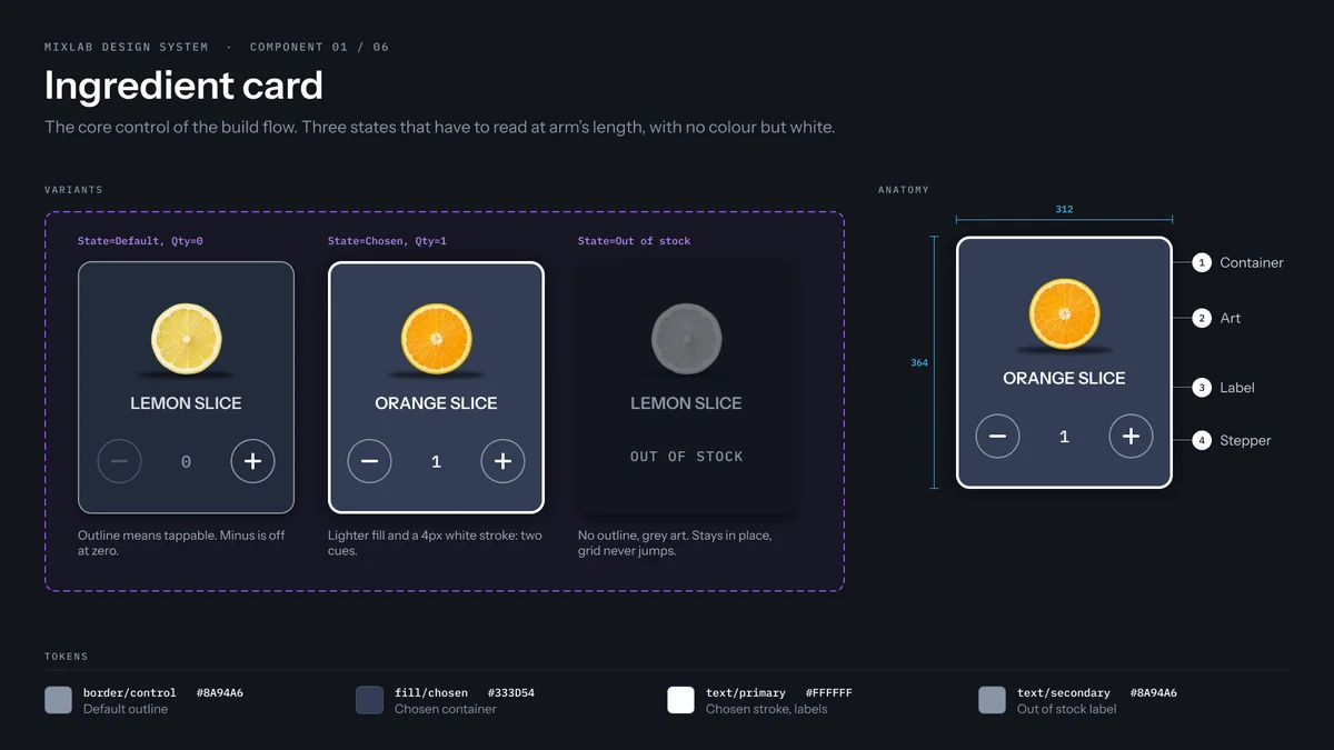
Ingredient card in default, chosen with a white outline, and out of stock, sunk and dimmed with its reason.
Ingredient card
The core control of the build flow. Three states that have to read at arm's length, with no colour but white.
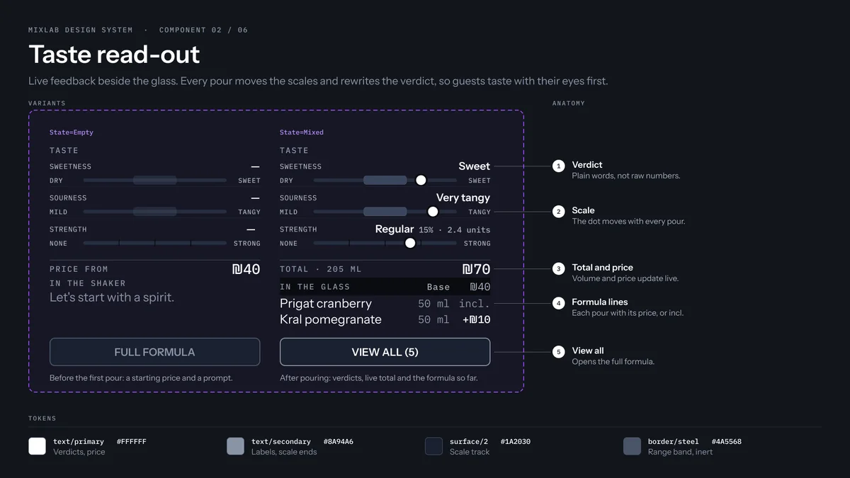
Taste meters for sweetness and sourness, and strength shown as a named step with the percentage and units.
Taste read-out
Live feedback beside the glass: every pour moves the scales, so guests taste with their eyes first.
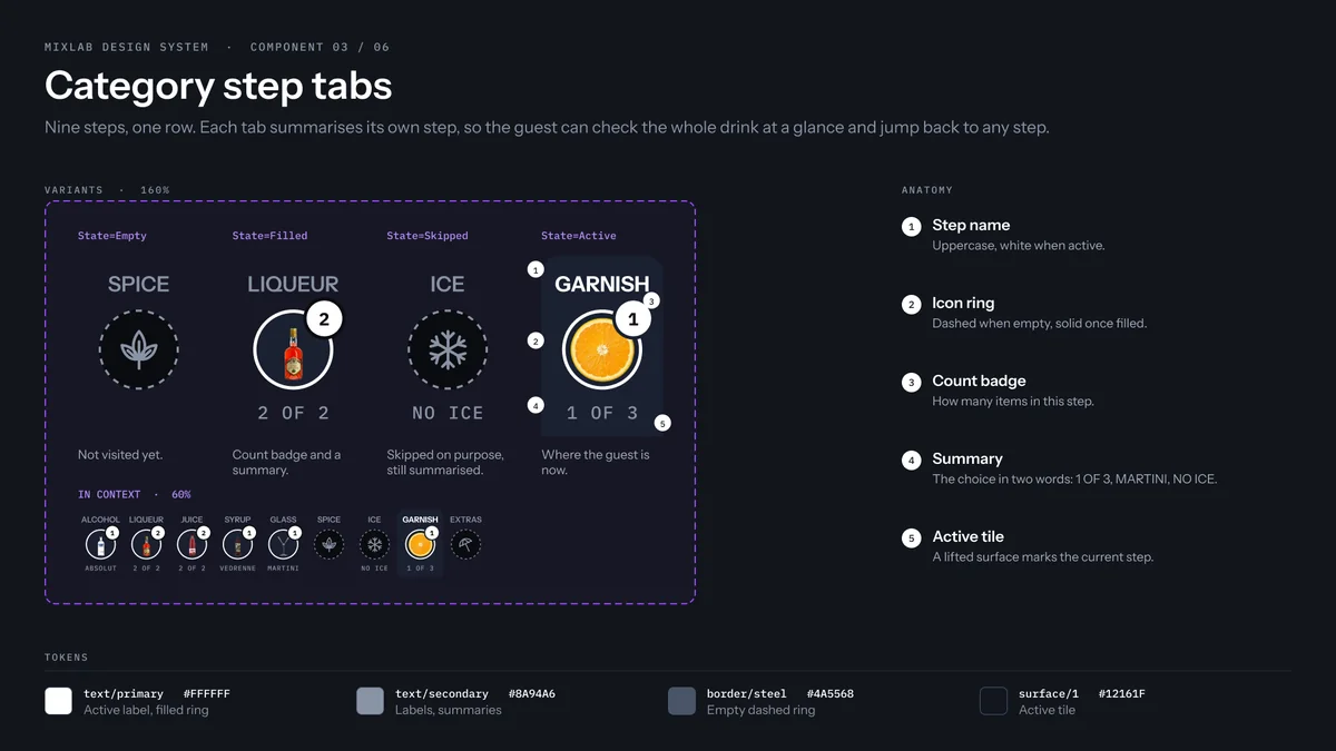
Category tab bar with nine icons: chosen tabs with a count badge and a caption, the open tab on a lighter fill, and empty tabs with a dashed outline.
Category step tabs
Nine steps, one row. Each tab sums up its own step, so the whole drink reads at a glance.
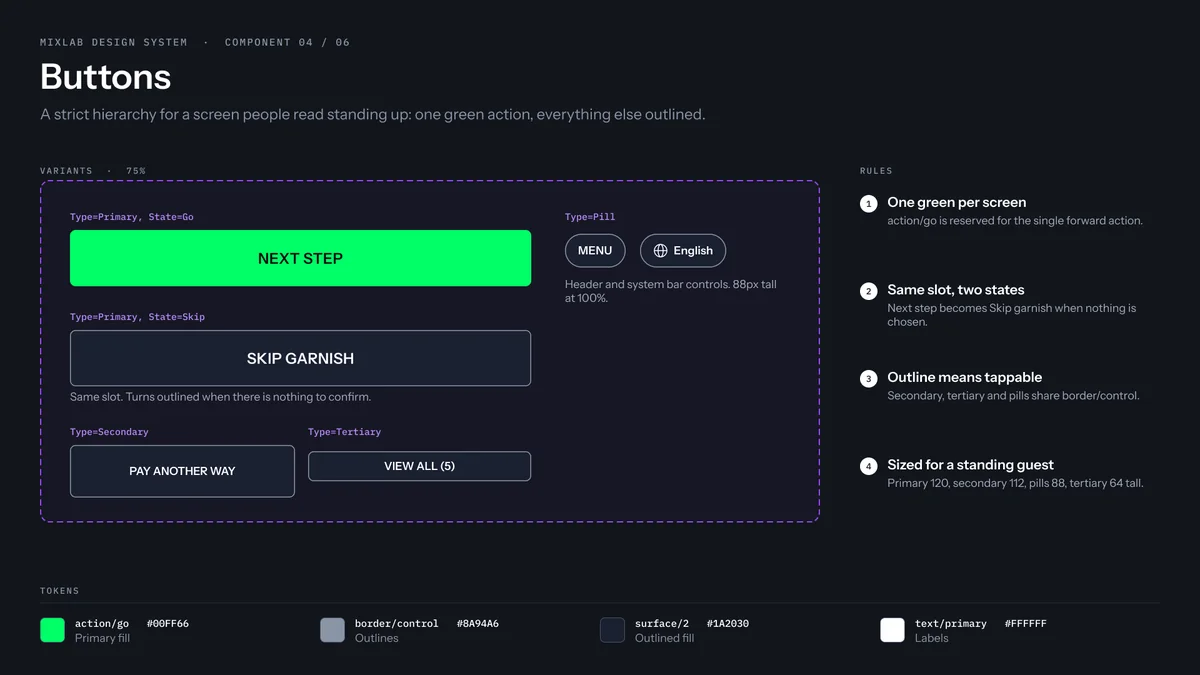
Buttons: a full-width green Next step as the one primary action, outlined secondary buttons such as Skip garnish and Pay another way, a View all button, and small pill controls for the menu and the language.
Buttons
A strict hierarchy for a screen people read standing up: one green action, everything else outlined.
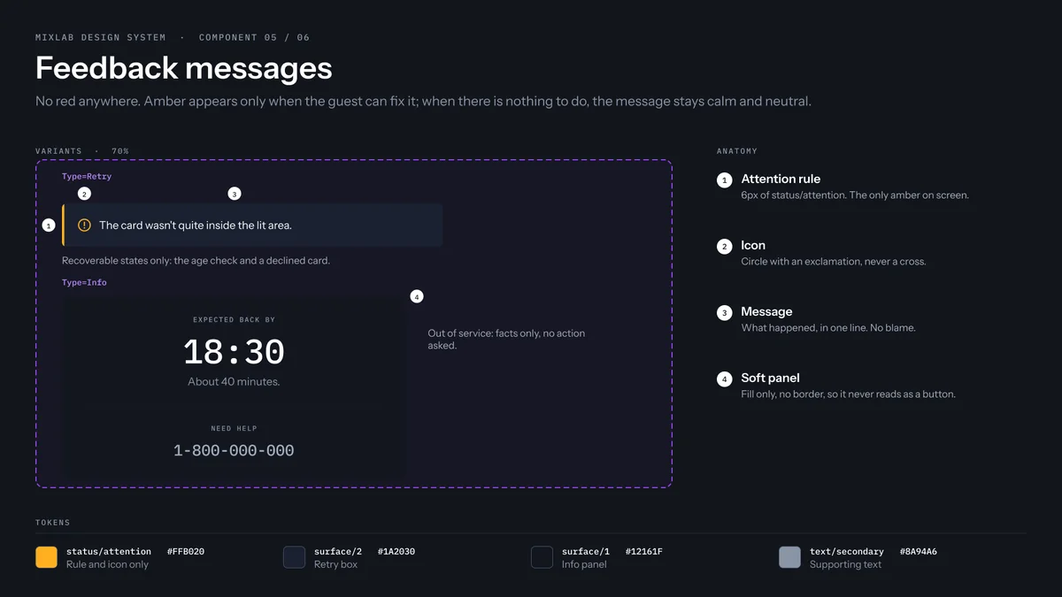
Feedback messages: an attention message with an amber rule and icon for something the guest can fix, and a calm neutral panel for an out-of-service notice with an expected time and a support number.
Feedback messages
No red anywhere. Amber appears only when the guest can fix it; when there is nothing to do, the message stays calm and neutral.
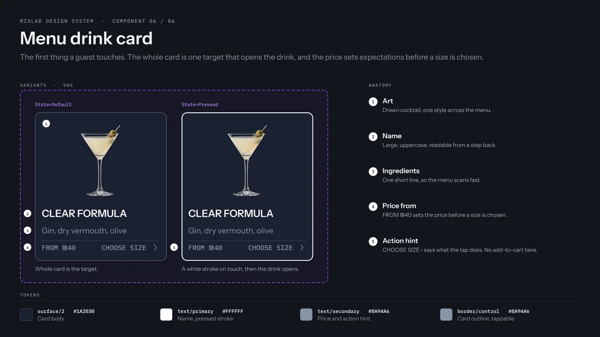
Menu drink card for Clear Formula in its default and pressed states, with the drink, its name, its ingredients, a From price and Choose size, and a white outline when pressed.
Menu drink card
The first thing a guest touches. The whole card is one target that opens the drink, and the price sets expectations before a size is chosen.

Edge cases

Designed beyond the happy path.

An ID that can't be read, a declined card, an item that runs out, a machine being serviced: each got its own designed screen, with one rule. Say what to do next, never just what failed.

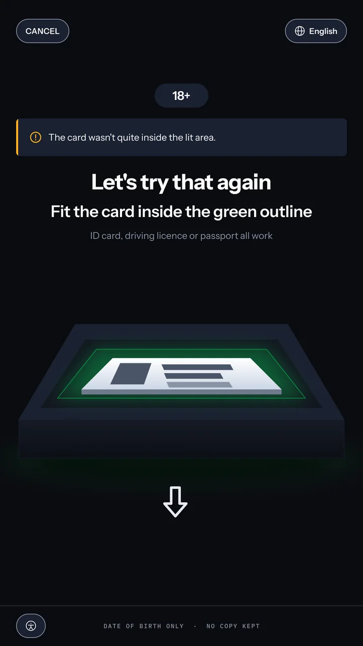
Age check retry: a message with an amber rule and icon saying the card wasn't quite inside the lit area, then the title Let's try that again, the instruction to fit the card inside the green outline, and the ID shown off-centre on the panel.

An ID check without blame

The reason matches the fix, and after three tries the machine takes the blame, not the guest.

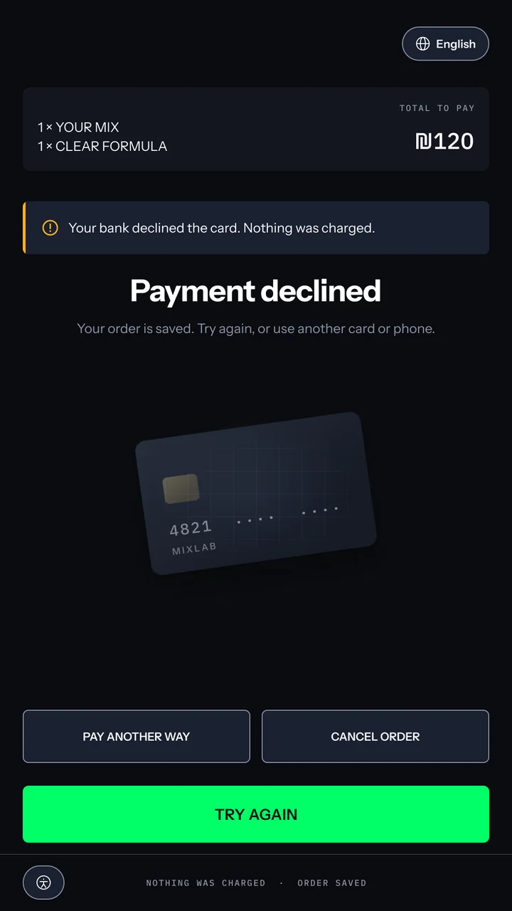
Payment declined: the title That payment didn't go through, a line that nothing was charged and the order is safe, Pay another way and Cancel order, the ₪120 total and a Try again button.

A decline that keeps the order

Nothing was charged and the order is safe. She can try again or pay another way, one tap from the total.

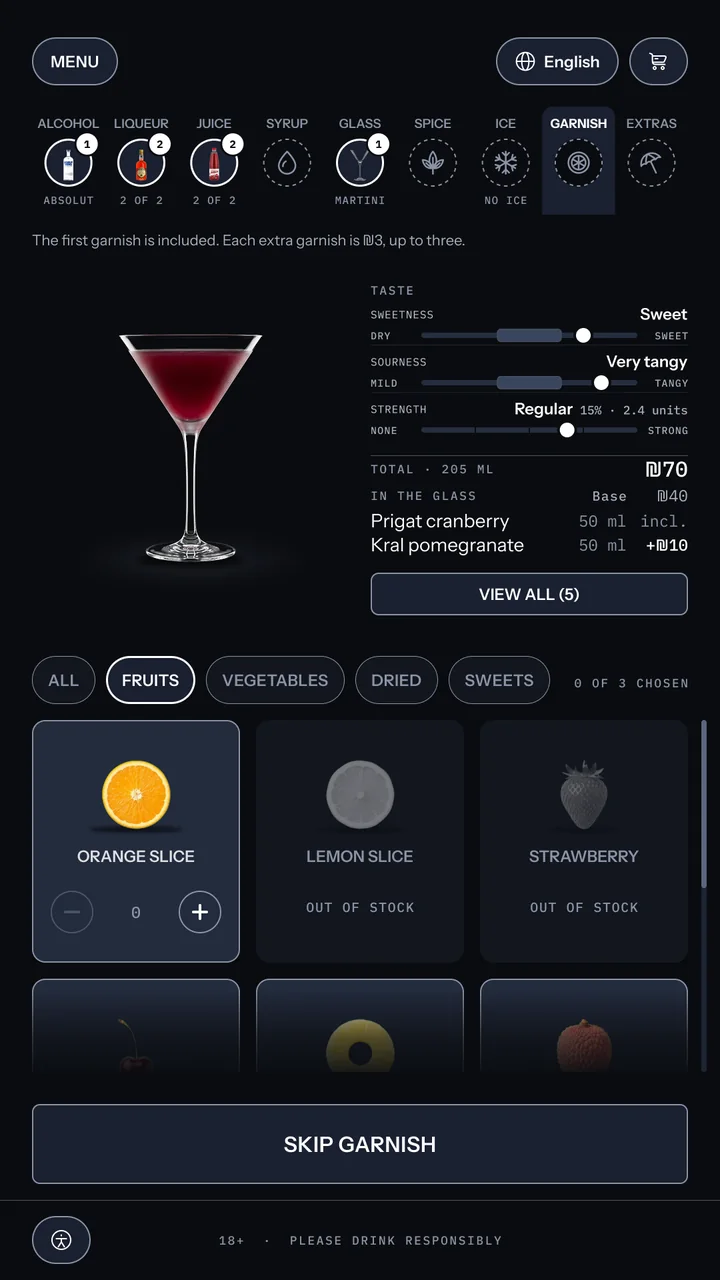
Out of stock: garnish step on Fruits, the lemon slice and strawberry cards greyed out with no outline and labelled out of stock, the rest of the grid available, and the action Skip garnish.

One item lost, not the order

Sold-out items stay in place, greyed and labelled. The grid doesn't jump, and the rest of the order is untouched.

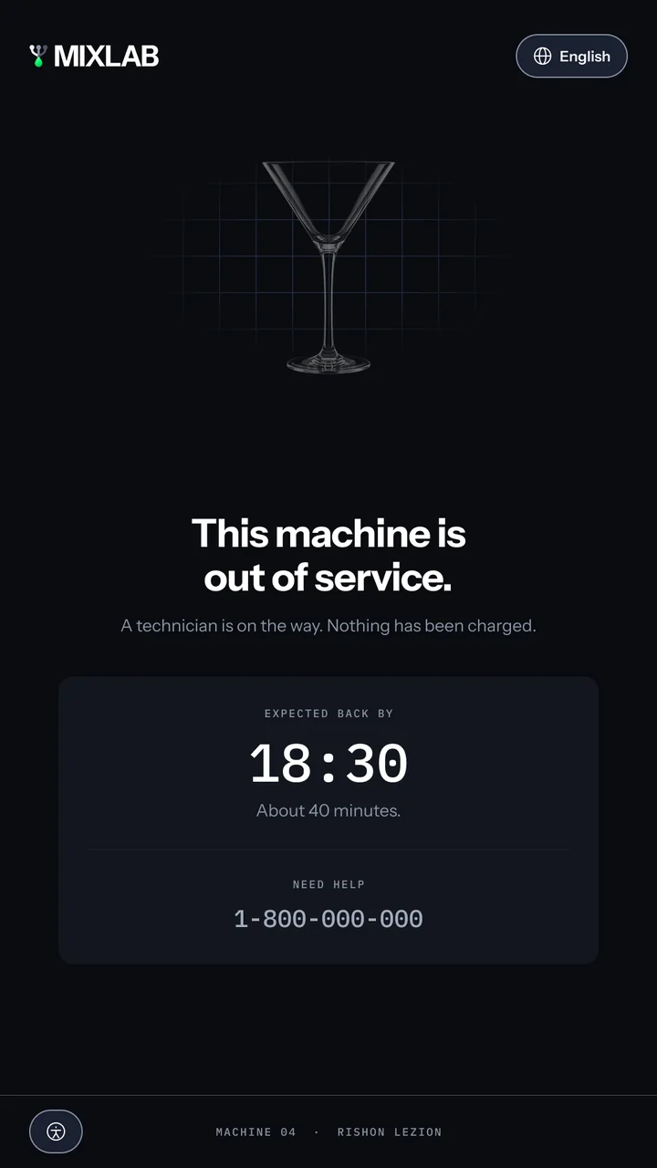
Maintenance screen: the wordmark, the title This machine is out of service, a line that a technician is on the way and nothing has been charged, expected back by 18:30, about 40 minutes, and a support number.

Out of service, with a time

It says when the machine will be back, about 40 minutes, gives a number to call, and confirms nothing was charged.

Want to hear more?

Happy to walk through the decisions, what each one cost, and what I'd change if I built it again.